In the fast-paced world of design, tools and software evolve rapidly, offering us new ways to bring our creative designs to life. As designers, we continuously strive to improve our practice by leveraging and applying these new possibilities in our work. That includes mastering new tools, whether transitioning from industry-standard software to a groundbreaking newcomer or simply exploring a different tool within the same category.
Learning how to use a new tool can be both exciting and daunting. It requires us to let go of old habits and dedicate precious time to familiarise ourselves with new interfaces, commands, and workflows. Figma has become the most popular design tool in recent years as it scores high on collaboration, flexibility, and accessibility. Axure, on the other hand, has remained a solid choice throughout the years for those looking to create detailed prototypes with advanced interactions.
In this article, we will share insights on how to master Axure. Whether you're a beginner looking for tips and tricks or just curious about Axure’s famous prototyping features, you've come to the right place. Before we head into it, let’s first introduce the tool.
What is Axure?
Axure RP is a powerful prototyping tool created in 2002. It allows designers to create wireframes and interactive prototypes with features like conditional logic, dynamic content, and data-driven design. Since its creation, Axure has become known for its features that simulate user interactions effectively, making it a preferred choice for designers looking to create high-fidelity prototypes. As Axure Cloud can be hosted on-premise/on company servers, it is great for teams that have high-security conditions and that need full access to the application infrastructure. Examples are organisations in the finance, health care, telecommunications, and public sectors.
Setup
Axure RP is the name for the desktop application, and Axure Cloud is where your files are published and shared on the browser. When working in Axure RP, you’re working on files with the extension “.rp”. If you work on team projects, you work on files with the extension “.rpteam”. Team projects allow different users part of a “workspace” to work in a single file simultaneously, but not on the same page. A single rpteam file is stored on Axure Cloud, and each teammate can edit their local copy of the team file. These changes then get pushed to the central team file on the cloud after checking in the changes made on the local copy.
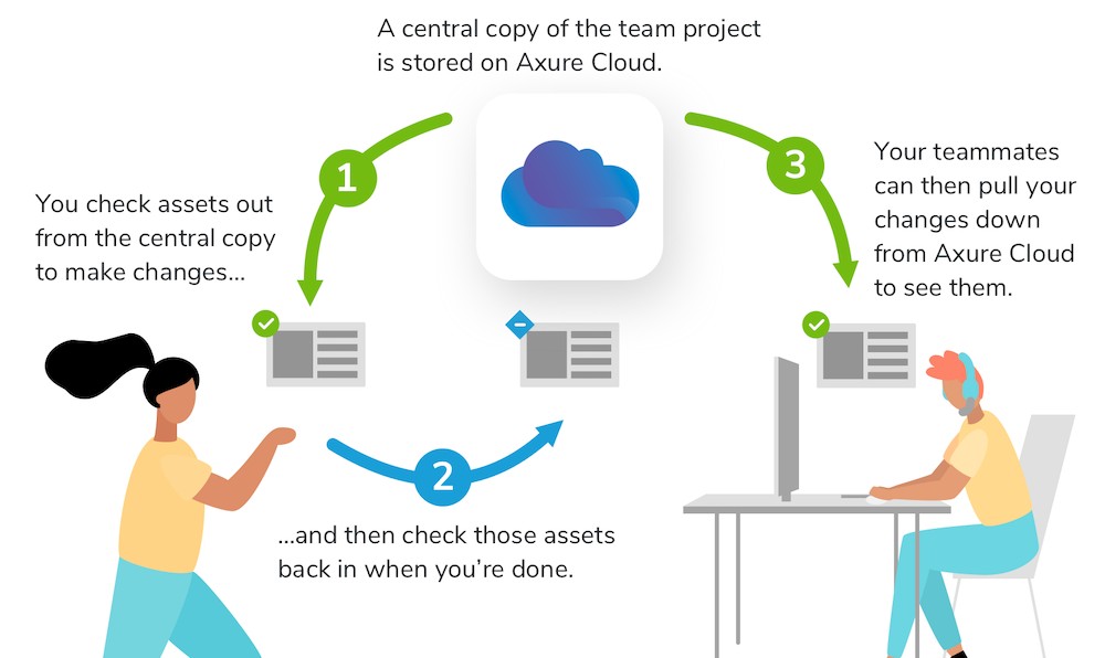
💡Tip 1: Always ensure your Axure files are saved on your C disk and in your Axure folder.
💡Tip 2: If you work with teammates on a team project, ask them how to check in and check out, and communicate to them which elements and pages you’re working on.
Pages and folders
When opening a new file in Axure, your canvas will be empty. To start designing, you need to create a page first. Pages can have any dimension or color, and it’s possible to select the size of a specific device or viewport. They can be reordered, indented and outdented and organised in folders. Once you have a page, you can start adding elements and prototyping. In the Outline panel, you can view the elements of a page and reorder, indent, and group them.
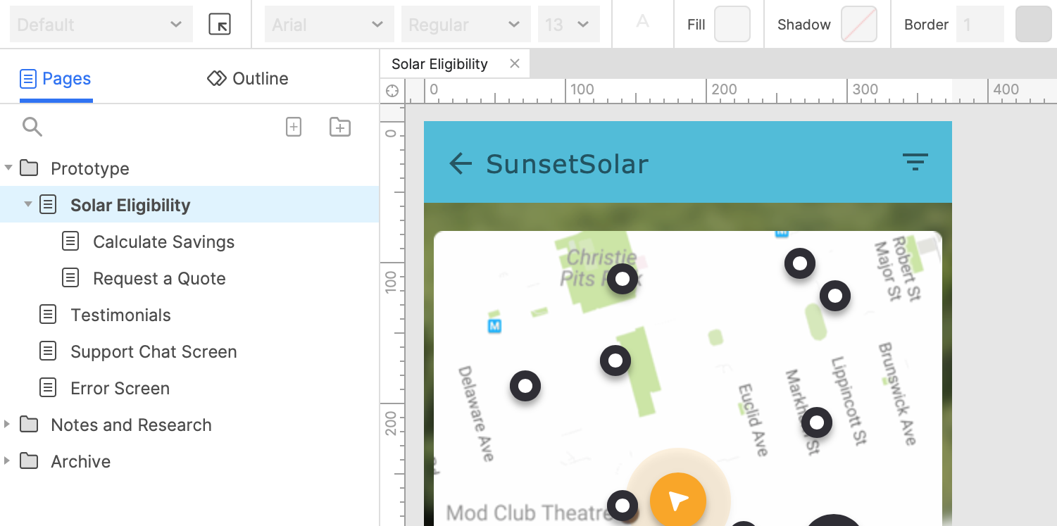
💡Tip: Keep in mind that the order of the elements on a page is very important, as certain interactions might not work if the order is not aligned with the interaction.
Pre-designed elements
Axure comes with “widgets”, or pre-designed and interactive UI elements that you can use as visual building blocks not to have to create every element from scratch. Widgets can be buttons, text fields, checkboxes,.... Drag and drop them on the canvas from the Libraries panel and use the style and interactions panels to customise them.
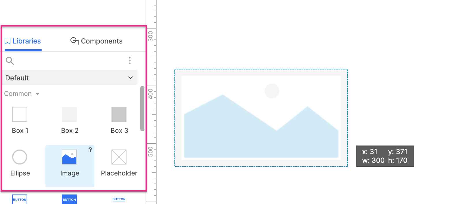
💡Tip 1: Although it takes a bit of time, defining style properties in the Widget Style Manager as early as possible for all widgets is a great way to increase consistency in your work.
💡Tip 2: Although choices are limited compared to the options in Figma’s community, you can find and download libraries on Axure's widget library page.
Adaptive design
No design tool is complete without the possibility to design for different devices. Axure, unfortunately, doesn’t offer the option to design for full responsiveness. However, “Adaptive Views” allow you to define views for different screen sizes or device types. For each view, you manually adjust your widgets' positions, sizes, and layouts to fit the specific screen size.
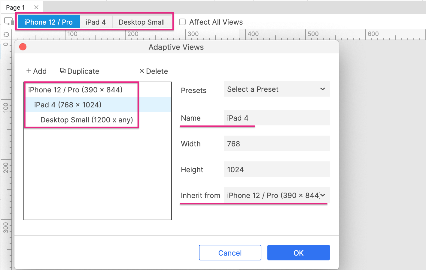
💡Tip 1: Define the adaptive views required for your project from the beginning so as not to lose time afterwards.
💡Tip 2: Uncheck the “affect all views” checkbox to avoid widgets that you adjusted for one view to also be adjusted for all other views.
Components
Components are a must in any design tool to ensure consistency and speed. After marking an element as a component in Axure, you can drag it from the components panel and drop it on a page. Similar to adaptive views, you can define component views and inheritance rules for different use cases, which is similar to Figma’s variants feature. It’s also possible to “unplace” certain elements of a component to not display them in specific views. Applying different interactions directly to instances of a single component is unfortunately not possible yet.

💡Tip 1: If you only need to change text values or images of an instance compared to its main component, head over to the interactions panel to override them.
💡Tip 2: If your component views have the same names and inheritance structure as your adaptive views, your component views will switch automatically in the browser along with your adaptive views.
States
“Dynamic panels” allow you to create a panel with elements and to design different states for it that can be displayed based on interactions. It’s a simple and effective way to show how elements change or respond dynamically to actions such as a click, triggered outside as well as inside the panel. Dynamic panels can be used for a wide range of design elements, from simple button states to complex interactive widgets. They are a great choice when only a specific section of a page changes after an interaction, as they reduce time spent designing an additional page.

💡Tip 1: Try out the fixed width/height as well as the “fit to content” settings for your dynamic panel to see which one suits best for your case.
💡Tip 2: If you want to add a horizontal and/or vertical scroll to a group of elements, place them in a dynamic panel, give them a fixed width or height, and adjust the scroll settings.
Working with data
If you need elements that have similar layouts but different values, such as cards, lists, tables or grids, you can use repeaters to save time in the long run. They allow you to design a template that is repeated and filled with content dynamically, such as with data from Excel sheets. Repeater interactions allow you to e.g. filter or sort data which makes for an interactive and realistic prototype.
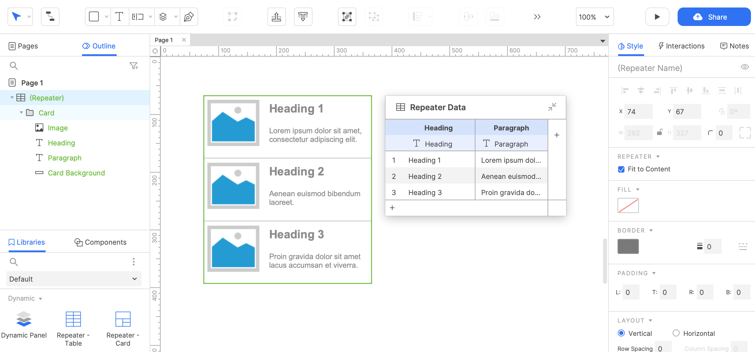
💡Tip: As a column or data field is necessary for each template item, think in advance about the items, their order, and their structure before designing the layout.
Interactions
And finally, Axure’s most famous feature: its interactions! There is a lot to cover here that would deserve its own article, so let’s keep it at the basics. Interactions in Axure are made up of Events, Actions, and sometimes Cases.
- Events are the triggers of an interaction and are the first thing you define, such as a click for a button.
- Actions are the responses to an event, such as Open Link which links to another page when a button is clicked. It’s also possible to define animations for actions.
- If events need to perform different actions based on a scenario, you can add and define cases with conditional logic. For example, a signup button that only links to the next page if the email input field is filled in.
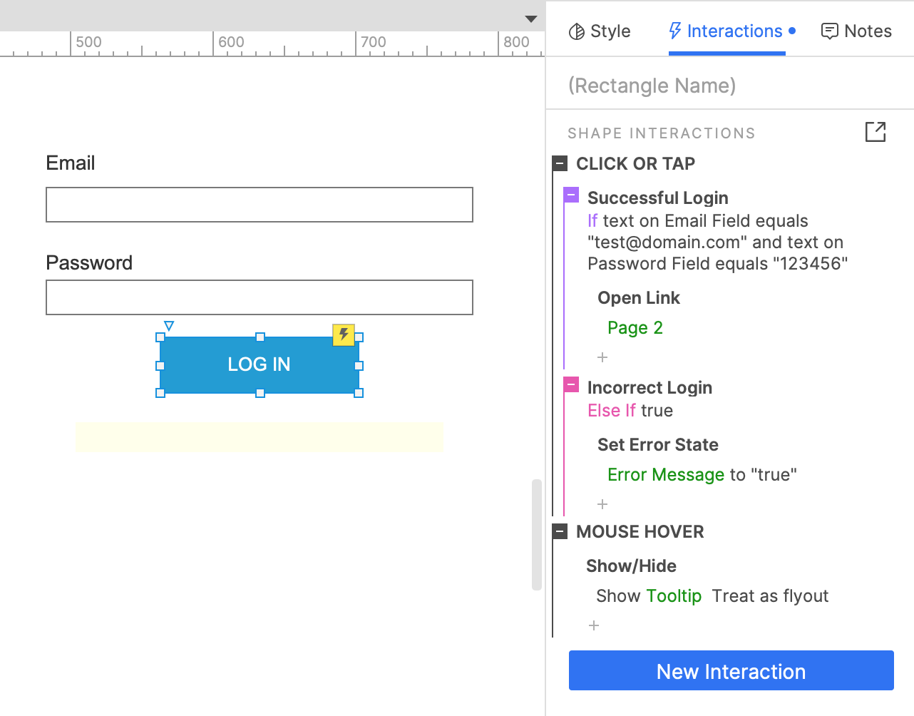
Actions can differ based on the type of widget, as they can have different events. For example, checkboxes, dynamic panels, repeaters, and text fields have their own unique events and actions.
The following advanced interactions are useful in the case of complex flows and interactions that have to be applied repeatedly or on a large number of targets. Their setup requires multiple steps and is best understood with examples.
- Variables, which are placeholders for dynamic data or user inputs for certain actions or cases
- Conditional logic, which refers to a system of rules to specify when an interaction should or should not occur
- Math, functions, and expressions to dynamically generate text and numeric values
Next to interactions, it’s also possible to define
- Style effects, which are styles applied to widgets when they are in a particular state, such as moused over or clicked on. These are particularly interesting for text, buttons, and dropdowns.
- Selection groups, which are groups of widgets in which only one widget at a time can be set to its selected state. It’s used to prototype Tab or Accordion menus or forms with radio buttons.
💡Tip 1: As is the case for widgets on a page, the order of events, actions, and cases is important if you want your interactions to work, especially when implementing conditional logic.
💡Tip 2: A lot is possible when it comes to interactions in Axure, and it’s easy to spend more time and effort than initially thought when setting them up. Remember that sometimes a simple interaction may suffice to convey the key functionality of a design.
💡Tip 3: If you want to understand all interaction options better, head over to Axure’s website, where you can find a list of the possible events, actions, style, and animation effects with an explanation for each of them.
So, here you have it, Axure’s main features and useful tips and tricks to master the tool. With these tips in mind, you’ll be ready to transform your ideas into realistic prototypes in no time. As with any tool, head over to Axure's website for comprehensive documentation and tutorials about its features.
Final thoughts
As a designer, it’s important to know your needs and priorities when choosing a design tool. If your goal is to create dynamic and complex prototypes, Axure is an excellent choice as its primary strength lies in its distinct prototyping features. Once the setup is done, creating complex interactions doesn’t take much time. But Axure also has its limitations: it has a steep learning curve, particularly for beginners, as its ability to create complex interactions takes time to master. It also doesn’t offer a free plan or operate in a web browser, which are important factors when choosing a design tool.
Mastering Axure opens up a world of possibilities to create powerful and realistic prototypes. By implementing the tips and tricks mentioned in this article, you’ll take your skills to new heights while saving time in the process. Practice and exploration are key – the more you experiment with Axure's features, the more adept you'll become.
So dive in, design with determination, and watch your designs come to life. Happy prototyping!
---
All pictures are taken form the Axure website.
